Interactive enhancements to maps and charts
Last week we announced a major update to workout charts - interval markers and hover tips.
One week later we're rolling out a few more enhancements we think you'll like.
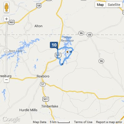
Smart distance markers on maps
Based on some user feedback, we've added a new "smart" feature for distance markers. On long rides and runs if you zoom out, you'll see less markers cluttering up the map. As you zoom in to more detail distance markers appear more frequently.
The great thing about this is you don't have to go into settings, pick a distance of 5km or 10km for your long rides, then pick a different distance when you flip over to look at a shorter run. It just does what it should do. This fits our philosophy of powerful tech that doesn't get in your way.
Lets take a look... who doesn't love an animated GIF?
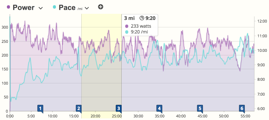
Hover Info Comes to intervals
We've now added a feature to show interval statistics when you move your mouse over the chart markers. This works for all markers: laps, hills, and distances. Below I'm showing mile markers, and I've moved the mouse over mile #7. Take a look:
We've got more exciting interactive features coming to the workout details page in the next few months. If you like (or don't like) what you see, tell us about it on facebook, twitter, our forums or via email.
Comments
I would like to see the option to add descriptions to laps in the interval section.